In the rapidly evolving landscape of digital entrepreneurship, the first impression a brand makes often happens in a fraction of a second. It occurs when a potential client scrolls past a social media post, opens a website, or receives a business card. In those fleeting moments, your visual identity, specifically your logo, whispers a story about who you are, what you value, and how much care you put into your craft. For many small business owners and creative freelancers, the journey from a vague idea to a polished professional brand can feel like a daunting mountain to climb. We often find ourselves caught between the high costs of hiring a boutique design agency and the frustration of trying to learn complex software that feels like it requires a PhD in graphic design.
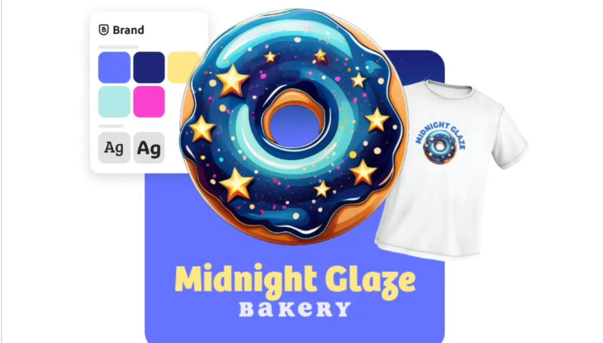
The good news is that the barrier to entry for high-quality design has never been lower, provided you know which tools to lean on. For those who want to bridge the gap between imagination and execution, exploring the AI logo maker option from Adobe Express can be a game-changer. This tool allows you to input your brand’s core personality traits and see them translated into visual concepts instantly. Instead of staring at a blank canvas for hours, you start with a foundation of professional layouts that you can then tweak, refine, and claim as your own. It’s about democratizing design, ensuring that a lack of technical training doesn’t stand in the way of a brilliant business idea.
The Psychology Behind a Great Logo
Before you dive into colors and fonts, it is essential to understand why certain logos stick in our minds while others fade into the background. A logo isn’t just a “pretty picture.” It is a psychological anchor. When people see the “swoosh” of Nike or the bitten apple of Apple, they aren’t just seeing shapes; they are feeling emotions: innovation, speed, reliability, or luxury.
To create something that resonates, you must first define your brand’s “North Star.” Ask yourself:
- What is my brand’s temperature? Is it warm and approachable (like a local bakery) or cool and professional (like a law firm)?
- Who am I talking to? A Gen Z audience might respond to bold, maximalist designs, while a high-end corporate audience likely prefers minimalism and serif fonts.
- What is the core message? If you are an eco-friendly brand, your visual language should probably lean toward organic shapes and earthy tones rather than neon colors and sharp angles.
![Image 1: A clean, modern workspace with a laptop showing various minimalist logo sketches and a mood board with color swatches.]
Why AI is a Creative Partner, Not a Replacement
There is a common misconception that using AI in the creative process is “cheating” or that it leads to generic results. However, the most successful modern creators view AI as a sophisticated brainstorming partner. Think of it as a junior designer who can provide you with a hundred sketches in five seconds. Your job is to be the Creative Director, the one who picks the best path and adds the “human soul” to the work.
When you use an intelligent logo generator, you are bypassing the “blank page syndrome.” The tool suggests combinations of typography and iconography that you might not have considered. Perhaps a certain shade of forest green looks unexpectedly sophisticated next to a copper accent. Perhaps a geometric font gives your bakery the modern edge it needs to stand out from the rustic competition. The magic happens in the refinement phase, where you adjust the spacing, fine-tune the colors, and ensure every element aligns with your vision.
Color Theory and Its Impact on Your Brand
One of the most powerful tools in your design arsenal is color. Science tells us that colors trigger specific physiological responses. For instance:
- Blue: Evokes trust, stability, and intelligence. This is why it’s the favorite of banks and tech companies.
- Red: Stimulates appetite and urgency. You’ll see this across the fast-food industry and “Clearance Sale” signs.
- Green: Represents growth, health, and tranquility, perfect for wellness brands or sustainable initiatives.
- Black and Gold: These are the universal languages of luxury and exclusivity.
When choosing your palette, aim for a primary color that does the heavy lifting and one or two accent colors. Avoid the temptation to use too many colors, as this can make your brand look cluttered and unprofessional. Consistency is the secret sauce of branding; once you pick your colors, use them everywhere, from your website header to your email signature.
![Image 2: A close-up of a designer’s hands using a tablet to adjust the curves of a vector logo, with vibrant color palettes visible on the screen.]
Typography: The Silent Communicator
If color is the emotion of your logo, typography is the voice. The fonts you choose tell the reader how to “hear” your brand name.
- Serif fonts (the ones with the little “feet” on the letters) suggest tradition, authority, and history.
- Sans-serif fonts are clean, modern, and tech-forward.
- Script fonts add a touch of elegance or personal flair, but they must be used sparingly to ensure readability.
A professional tip: never sacrifice legibility for style. Your logo needs to be readable whether it’s on a massive billboard or a tiny favicon in a browser tab. If someone has to squint to read your brand name, the logo has failed its primary mission.
Building a Scalable Identity
A common mistake new business owners make is designing a logo that only looks good on a white background. In the real world, your logo needs to be a chameleon. It will appear on dark backgrounds, over photos, on textured paper, and in black-and-white printouts.
When you finish your design, test it in various formats. Does it work as a simplified icon (a “brand mark”) without the text? Does the text stand alone as a “wordmark”? Having these variations ensures that your brand looks professional across all touchpoints. This versatility is what separates a hobbyist’s project from a professional brand identity.
![Image 3: A collection of branded stationery, including a tote bag, a coffee mug, and a business card, all featuring the same cohesive, well-designed logo.]
Taking the Leap
The journey of building a brand is rarely a straight line. It involves experimentation, a few “wrong turns,” and a lot of heart. However, the process of defining your visual identity is one of the most rewarding parts of entrepreneurship. It is the moment your dream starts to look like a reality. It’s the moment you can point to a screen or a product and say, “This is mine.”
In today’s market, you don’t need to be a professional artist to have a professional look. You just need the right perspective and a willingness to explore the tools available to you. By combining your unique story with modern design technology, you can create a visual presence that doesn’t just look good, it feels right.
Once you have that foundational logo, the rest of your branding, your website, your social media, your packaging, will naturally fall into place. You aren’t just making a logo; you are building the visual home for your business. So, take that first step, trust your intuition, and start creating something that you are proud to share with the world. The tools are ready when you are; all that’s missing is your unique perspective.
Related Posts